Case Study
CartFlows 3.0
(UI/UX Revamp)
Products
CartFlows: Funnel Builder
My Role
Research, Design,
Management, Testing Scope
Teams
Collaboration with Development &
Support Teams
Context
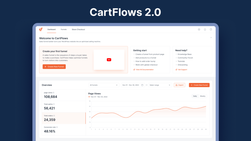
A product running on a two-and-a-half-year-old interface
That gap showed. The interface carried known, obvious usability issues that had never been prioritized against feature work. Interactions felt abrupt — state changes with no transition, loading states that just snapped in, hover and focus feedback that was inconsistent from one screen to the next. And separately from CartFlows itself, the rest of Brainstorm Force’s product line — Astra, Spectra, SureForms, and others — had been consolidating around a shared design system, Force UI. CartFlows hadn’t moved with it, so it was starting to feel like a different product from its own siblings.
What Was Actually Wrong?
Three separate problems, not one
- Usability issues and accumulated bugs. Several screens had known, reported friction points that had been living in the backlog rather than getting fixed — inconsistent states, confusing settings groupings, edge cases that broke visually rather than functionally.
- No real interaction or motion language. Transitions, hover states, and loading feedback were either missing or inconsistent from screen to screen, which made the product feel dated even where the underlying functionality was fine.
- Disconnected from the rest of the ecosystem. Brainstorm Force had already shared design system across other products. CartFlows running its own separate visual language meant duplicated component work, and a jarring switch for anyone using CartFlows alongside Astra or Spectra.
Goals
What "redesign" actually had to mean here
Fix, don't just re-skin
Every known usability issue and UI bug on the list had to be resolved as part of the rebuild, not carried forward under a new coat of paint.
Give it a motion language
Consistent transitions, hover states, and loading feedback across every screen — the product needed to feel considered, not assembled.
Adopt Force UI, not imitate it
Rebuild on the actual shared component system used across Brainstorm Force, so CartFlows benefited from the same maintenance, consistency, and future updates as the rest of the ecosystem.
Stay shippable throughout
CartFlows couldn't go dark for a rewrite. The redesign had to roll out screen by screen while the product stayed usable and supportable the whole way through.
Surface Area
What actually got rebuilt?
Funnel Builder
The core canvas, rebuilt for clearer step states and smoother interactions, while keeping the canvas-based structure that's unique to how CartFlows works.
Checkout Editor
Brought onto Force UI form and layout components, with consistent field states and clearer grouping between checkout content and behavior settings.
Order Bumps & Upsells
Restructured into a clearer, multi-item settings pattern as part of the same visual and interaction overhaul as everything else.
Global Settings
Reorganized into Force UI's standard settings layout, replacing CartFlows' own bespoke structure with the pattern merchants already knew from other products.
Analytics Dashboard
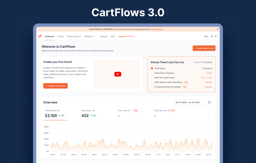
Rebuilt data views and empty states, with consistent loading and transition patterns replacing the old instant-snap behavior.
Shared Interaction Patterns
A single motion and feedback language: hover, focus, transitions, loading states: defined once and applied everywhere, instead of screen-by-screen improvisation.
Key Decisions
Trade-offs in bringing CartFlows onto new UI
Rebuild on Force UI, not restyle over old markup
It would have been faster to reskin the existing CSS to look closer to Force UI. I pushed for an actual rebuild on the shared component library instead — more upfront migration work, but it meant CartFlows would inherit future Force UI updates automatically instead of drifting out of sync again in another two years.
Keep the funnel canvas as a deliberate exception
Force UI's standard components cover forms, settings panels, and layout — not a drag-and-drop funnel canvas. Rather than forcing that into generic components, I treated the builder as an intentional exception: Force UI tokens for color, type, and spacing, but custom interaction patterns where the product's actual function required it.
Roll out screen by screen, not as a single relaunch
A big-bang rewrite risked shipping every fix at once with no room to catch problems early. Sequencing the rebuild by surface — settings first, then checkout editor, then the builder — meant real usage on early screens could inform decisions on the ones that came after.
Validation
Checking it held up before it shipped
Each redesigned surface went through internal design review with Santhya against Force UI’s actual guidelines, not just a visual gut check, to make sure component usage stayed consistent with how the rest of the ecosystem implemented the same patterns. Feasibility and sequencing for the canvas-specific exceptions were worked through directly with Sarang. Known bugs from the old interface were tracked against the redesign screen by screen, so the rebuild had a concrete checklist of issues to close rather than an open-ended “make it better.”
Outcome
What changed for the person using it
The bigger lesson: redesigning inside a shared design system is a different problem from redesigning in isolation. Most of the hard calls weren’t about individual screens — they were about where CartFlows’ own needs, like the funnel canvas, justified breaking from the system, and where they didn’t.
Want to see the full before/after?
Happy to walk through the old interface, the Force UI migration decisions, or any specific screen in more depth.